Hot Take: There Are Only Four Data Visualization PatternsーThe Rest Are Just Fancy Pansies
visualization
ggplot
plotnine
Author
cstorm125
Published
July 10, 2025
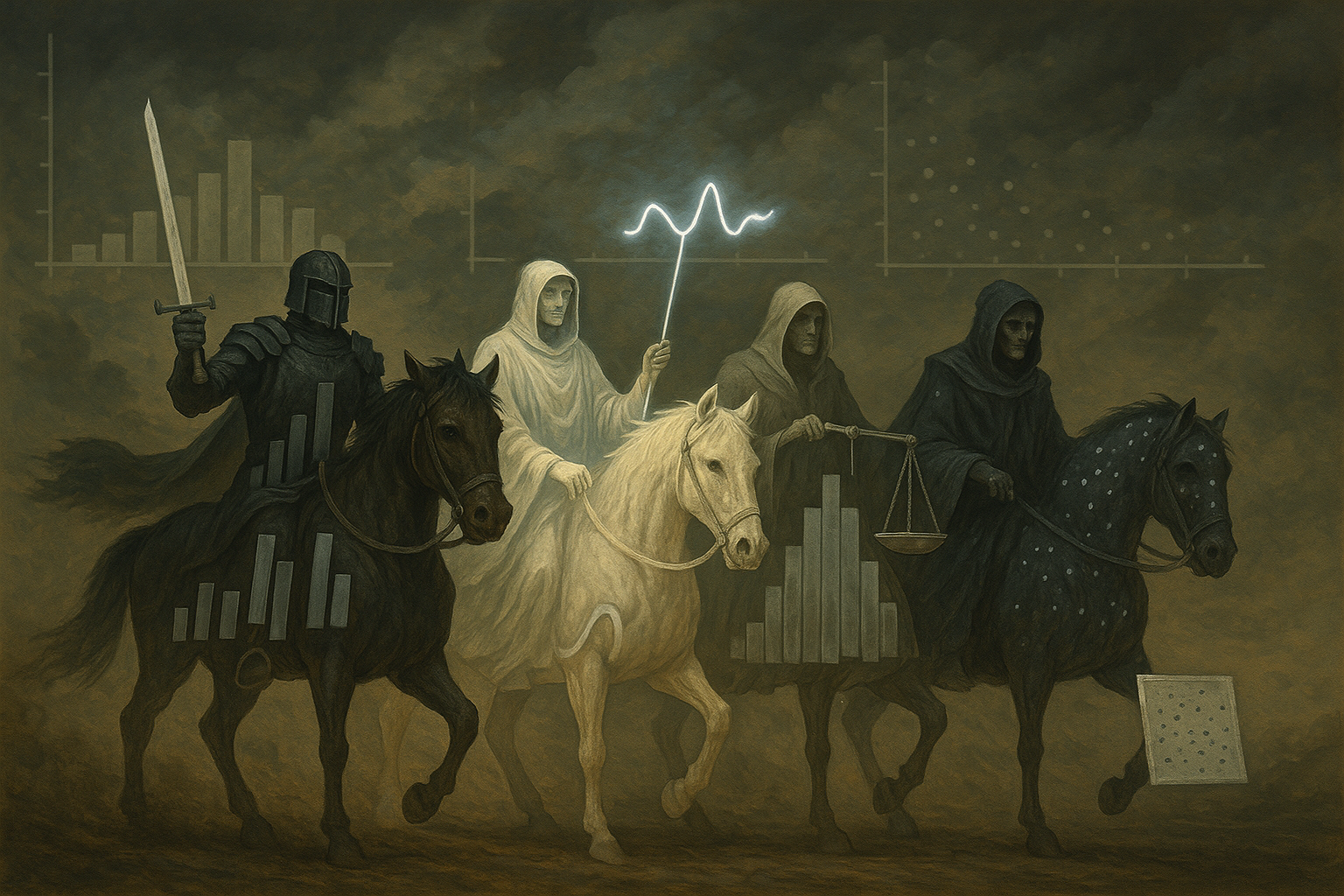
Here me out. Data visualization is one of my biggest hobbies. In fact, back in 2019, I reproduced all 60+ plots from the Financial Times Visual Vocabulary using ggplot’s Python port plotnine. Just because I can. However, one thing I noticed since moving to Big Retail is that people really go out of their ways to prioritize substance over flair. We are famous for writing documents over slides; but I have never heard someone mentioned that the most common data visualization instrument is a table. I believe this is because if you are given time to carefully read and understand (10-30 minutes doc read vs 1 minute per slide), you can comprehend what even the most simplistic visualization like a table is trying to tell you. My premise is that if our goal is to tell a meaningful story with data, to a reasonable human being given reasonable time to consume, there are only four data visualization patterns you need: line plots, bar charts, histograms, and scatte rplots.
featured_image
Let us reuse the transaction-level UCI Online Retail dataset with category column we added using LLM in the sales prediction post. Imagine you are a consultant the UK shop owner hired to have a look at their business during a time period. What are the key visualizations you need to understand the data and make critical suggestions for improvement?
TL;DR - Line plots display changes over time. - Bar charts compare numerical values among categorical variables. - Histograms show how a numerical variable is distributed; box/violin/swarm plots are basically putting histograms next to one another. - Scatter plots demonstrate relationship between two numerical variables; heatmaps do the same for two discrete variables.
Code
from plotnine import*from mizani.labels import*from mizani.formatters import*import seaborn as snsimport plotly.express as pximport matplotlib.pyplot as pltimport pandas as pdimport numpy as npfrom tqdm.auto import tqdmimport datetimefrom ucimlrepo import fetch_ucirepo def string_to_yearmon(date): date = date.split() date = date[0].split('/') + date[1].split(':') date = date[2] +'-'+ date[0].zfill(2)return datedef string_to_date(date): date = date.split() date = date[0].split('/') + date[1].split(':') date = date[2] +'-'+ date[0].zfill(2) +'-'+ date[1].zfill(2) #+ ' ' + date[3].zfill(2) + ':' + date[4].zfill(2)return datedef date_to_dow(date_string): dt_object = datetime.datetime.strptime(date_string, '%Y-%m-%d') dow_number = dt_object.strftime('%w') dow_name = dt_object.strftime('%A')returnf"{dow_number}_{dow_name}"online_retail = fetch_ucirepo(id=352) transaction_df = online_retail['data']['original']original_nb = transaction_df.shape[0]#create yearmon for train-valid splittransaction_df['yearmon'] = transaction_df.InvoiceDate.map(string_to_yearmon)transaction_df['invoice_date'] = transaction_df.InvoiceDate.map(string_to_date)transaction_df['dow'] = transaction_df.invoice_date.map(date_to_dow)#get rid of transactions without cidtransaction_df = transaction_df[~transaction_df.CustomerID.isna()].reset_index(drop=True)has_cid_nb = transaction_df.shape[0]#fill in unknown descriptionstransaction_df.Description = transaction_df.Description.fillna('UNKNOWN')#convert customer id to stringtransaction_df['CustomerID'] = transaction_df['CustomerID'].map(lambda x: str(int(x)))#simplify by filtering unit price and quantity to be non-zero (get rid of discounts, cancellations, etc)transaction_df = transaction_df[(transaction_df.UnitPrice>0)&\ (transaction_df.Quantity>0)].reset_index(drop=True)has_sales_nb = transaction_df.shape[0]#add salestransaction_df['Sales'] = transaction_df.UnitPrice * transaction_df.Quantity#clean descriptiontransaction_df['Description'] = transaction_df['Description'].map(lambda x: x.replace('.','').strip())#attach categoryproduct_description_category = pd.read_csv('../../data/sales_prediction/product_description_category.csv', sep='|')transaction_category_df = transaction_df.merge(product_description_category,left_on='Description', right_on='product_description', how='left')#fill in unknown if no categorytransaction_category_df['category'] = transaction_category_df['category'].fillna('Unknown')#focus on UK store; we have incomplete data for 2011-12 so we let's remove itdf = transaction_category_df[(transaction_category_df.Country=='United Kingdom')& (transaction_category_df.yearmon<'2011-12')]\ .drop(['Country','Description','InvoiceDate'], axis=1)\ .reset_index(drop=True)#reshuffle columnsdf = df[['invoice_date','InvoiceNo','CustomerID','StockCode','product_description','category','UnitPrice','Quantity','Sales','yearmon','dow']]df.tail(5)
invoice_date
InvoiceNo
CustomerID
StockCode
product_description
category
UnitPrice
Quantity
Sales
yearmon
dow
340668
2011-11-30
579885
15444
85034C
3 ROSE MORRIS BOXED CANDLES
Home Decor
1.25
4
5.00
2011-11
3_Wednesday
340669
2011-11-30
579885
15444
21742
LARGE ROUND WICKER PLATTER
Kitchen and Dining
5.95
2
11.90
2011-11
3_Wednesday
340670
2011-11-30
579885
15444
23084
RABBIT NIGHT LIGHT
Home Decor
2.08
6
12.48
2011-11
3_Wednesday
340671
2011-11-30
579885
15444
21257
VICTORIAN SEWING BOX MEDIUM
Stationary and Gifts
7.95
1
7.95
2011-11
3_Wednesday
340672
2011-11-30
579885
15444
21259
VICTORIAN SEWING BOX SMALL
Home Decor
5.95
1
5.95
2011-11
3_Wednesday
Before the exploration, we need to know the scope of the dataset. Since the dataset only contains one year’s worth of transaction records, we will not be able to perform any analysis regarding conversions (since we do not have data on those who visited but DID NOT make a purchase), profitability (since costs are not available), and year-on-year growth (since we only have one year of data).
Code
print(f'''Time period: {df.invoice_date.min()} to {df.invoice_date.max()}Number of unique customers: {df.CustomerID.nunique()}Number of unique products: {df.StockCode.nunique()}Number of unique categories: {df.category.nunique()}Number of unique transactions: {df.InvoiceNo.nunique()}Total Sales: {df.Sales.sum()}''')
Time period: 2010-12-01 to 2011-11-30
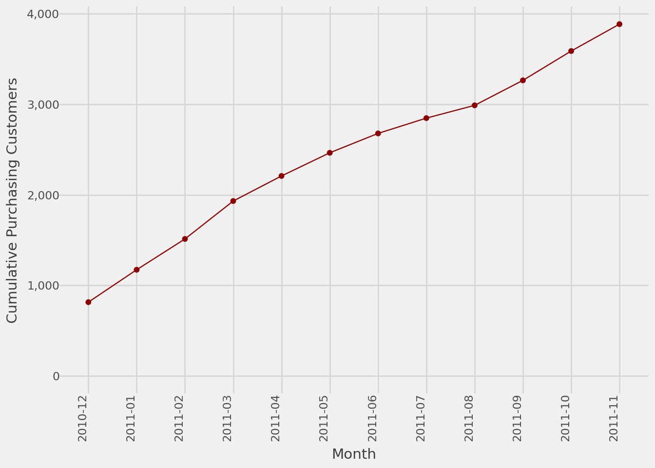
Number of unique customers: 3886
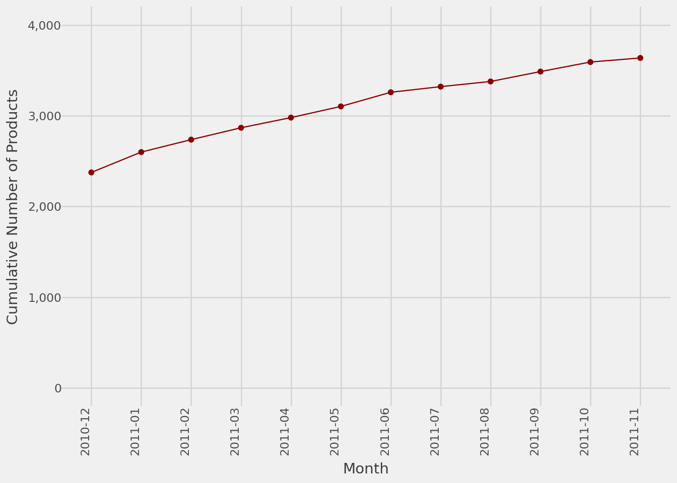
Number of unique products: 3636
Number of unique categories: 10
Number of unique transactions: 15940
Total Sales: 6872399.784
With that out of the way, let us get exploring.
Business at a Glance
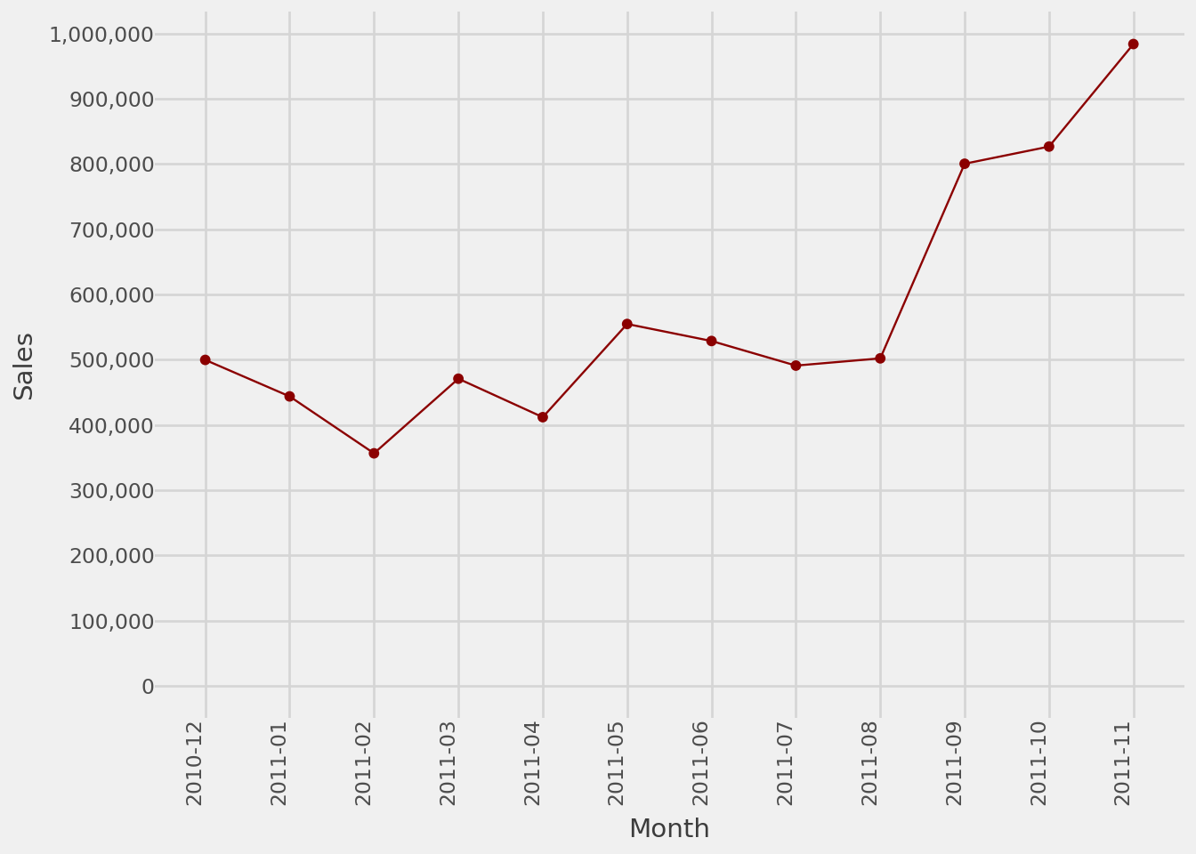
The first thing we want to look at is how the 6.9M GBP total sales is spread out during the year. We see the typical year-end peak season in retail. Even without year-on-year data, by comparing 2010-12 and 2011-11, we can see that the current year’s peak is likely 2x the previous year’s. Business seems to be going well overall.
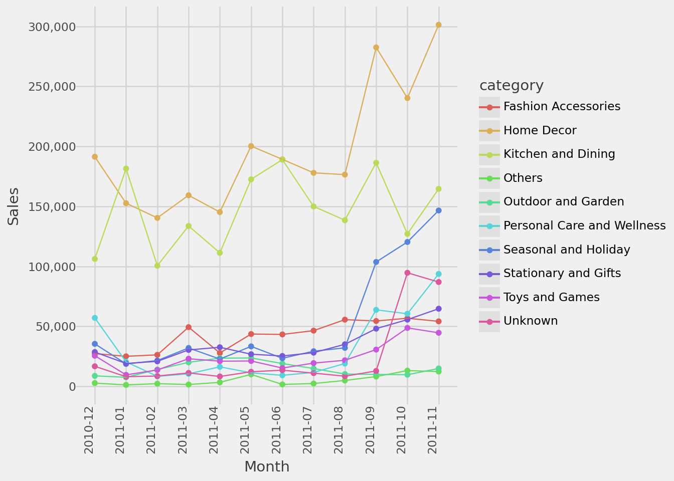
Looking at the same line plot by category, we can see the shop focuses on Home Decor and Kitchen and Dining. During peak season, gift-worthy categories namely Seasonal and Holiday, Toys and Games and Personal Care and Wellness made substantial jump in terms of sales.
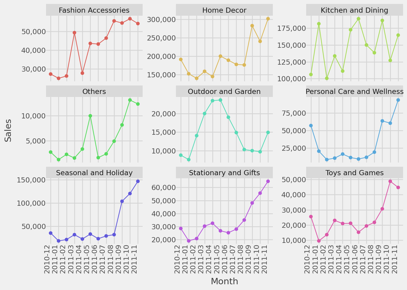
The seasonality of each category is even more transparent when we look at the faceted line plots. For instance, while most categories follow the peak-at-year-end pattern, we notice Outdoor and Garden had its peak during the spring months and Kitchen and Dining has stable sales throughout the year.
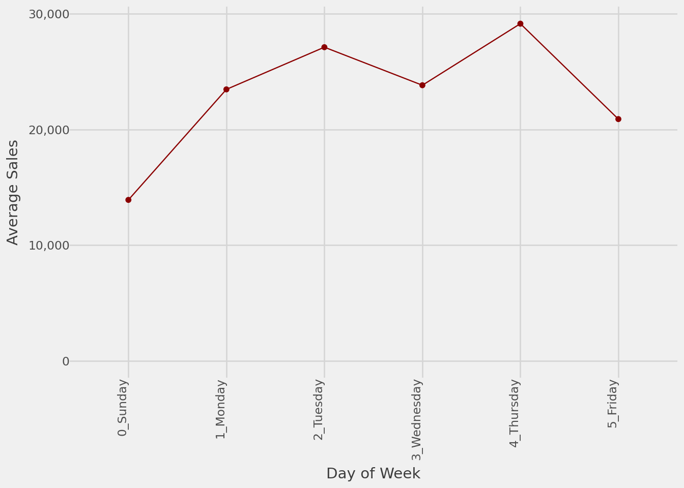
While we are at seasonality, let us look at average sales by day of week to see which ones are the most and least busy. If the shop owner has not told us, we now know that they close on Saturdays and usually have a slow Sunday. Perhaps we can consider promotions specific to Sundays to smoothen the sales during the week.
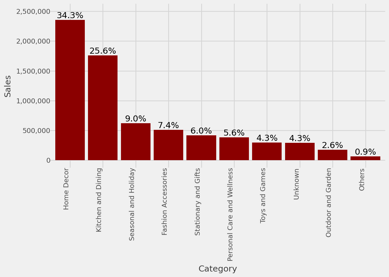
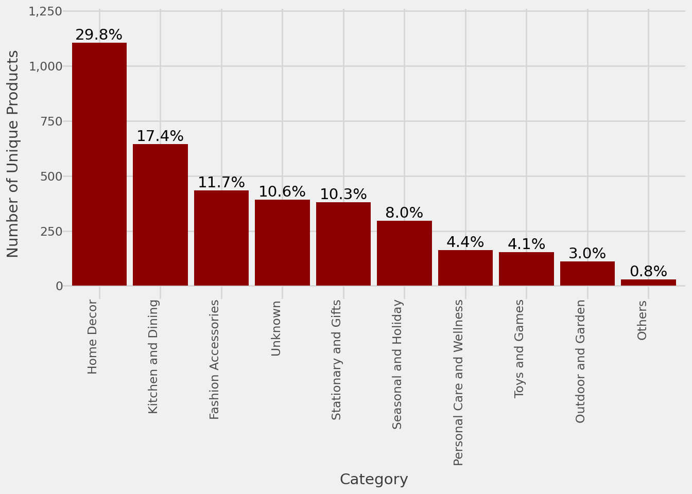
We now turn our attention to the product offerings. The bar charts reaffirm our focus on Home Decor and Kitchen and Dining with over half of total sales coming from those categories. We see similar tendencies for number of unique products per category.
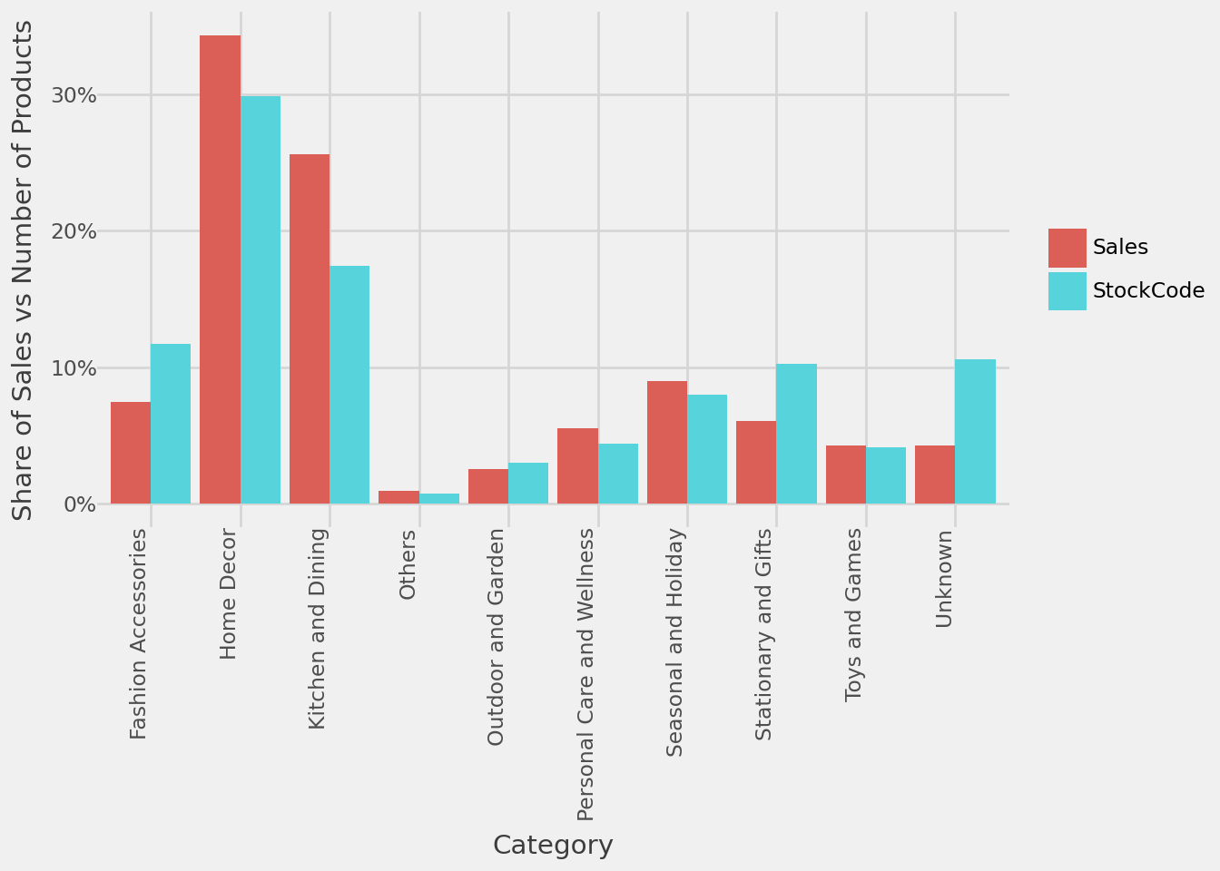
By comparing share of sales vs share of number of products each category has, we can pinpoint some imbalances. For Kitchen and Dining, we might prefer this situation where a small selection contributes to disproportionately larger share of sales. However, we might be stocking up too many unique products in Stationary and Gifts and Unknown to be worth their shares of sales.
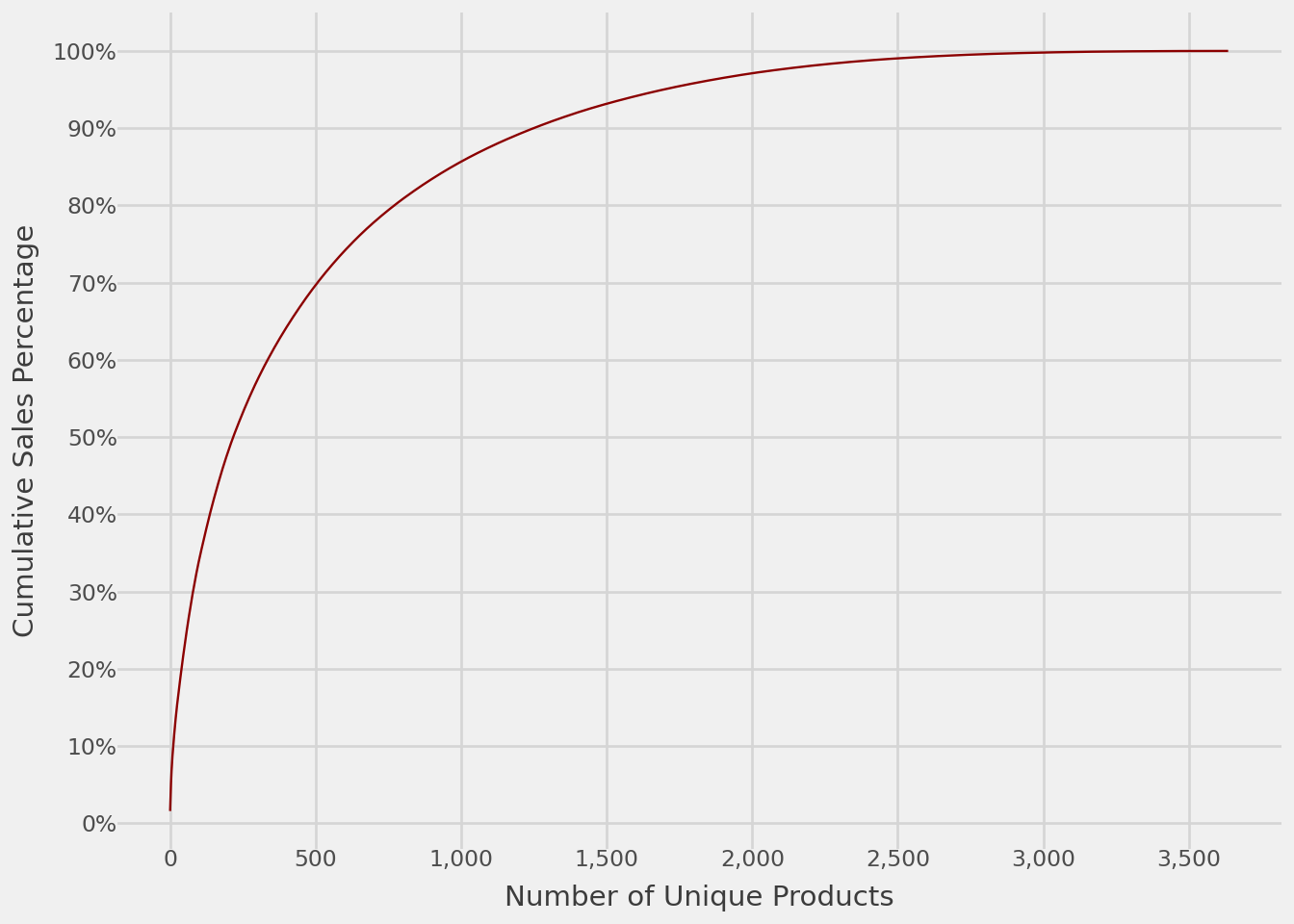
Without stock purchase information, we cannot calculate inventory turnover. Nonetheless, we can still look at the cumulative sales percentage to determine the head products, about 750 items (about 20% of all unique products) that contribute to 80% of the sales. These head products are the main reason customers visit our shop; they form the basis of our product strategy. We either shift investments from tail products to these head products if their profit margins are high enough, or use them as gateway products for customers to purchase from other profitable items.
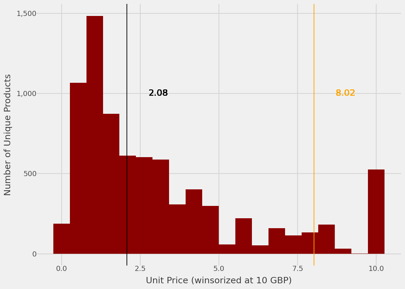
Next, we turn our attention to pricing. Histograms are a perfect tool to see how numerical values are spread out, such as that of price distribution. The median and mean unit prices are 2.08 GBP and 8.02 GBP respectively. The plot below gives us an intuition on the prices customers expect to see when visiting our shop.
Code
d = df[['StockCode','UnitPrice']].drop_duplicates()d['UnitPrice_capped'] = d['UnitPrice'].map(lambda x: x if x<10else10)g = (ggplot(d, aes(x='UnitPrice_capped'))+ geom_histogram(bins=20,fill='darkred')+ geom_vline(xintercept=d.UnitPrice.mean(),color='orange')+ geom_vline(xintercept=d.UnitPrice.median(),color='black')+ geom_text( x = d.UnitPrice.mean()+1, y =1000, label =round(d.UnitPrice.mean(),2), color='orange')+ geom_text( x = d.UnitPrice.median()+1, y =1000, label =round(d.UnitPrice.median(),2), color='black')+ xlab('Unit Price (winsorized at 10 GBP)') + ylab('Number of Unique Products') + scale_y_continuous(labels=label_comma())+ theme_538() )g
You can see 95% of our products are priced below 11 GBP. And the 0.1% with unusually high price has a high chance of being data input mistakes.
Code
d.UnitPrice.describe(percentiles=[i/10for i inrange(10)]+[.95,.999])
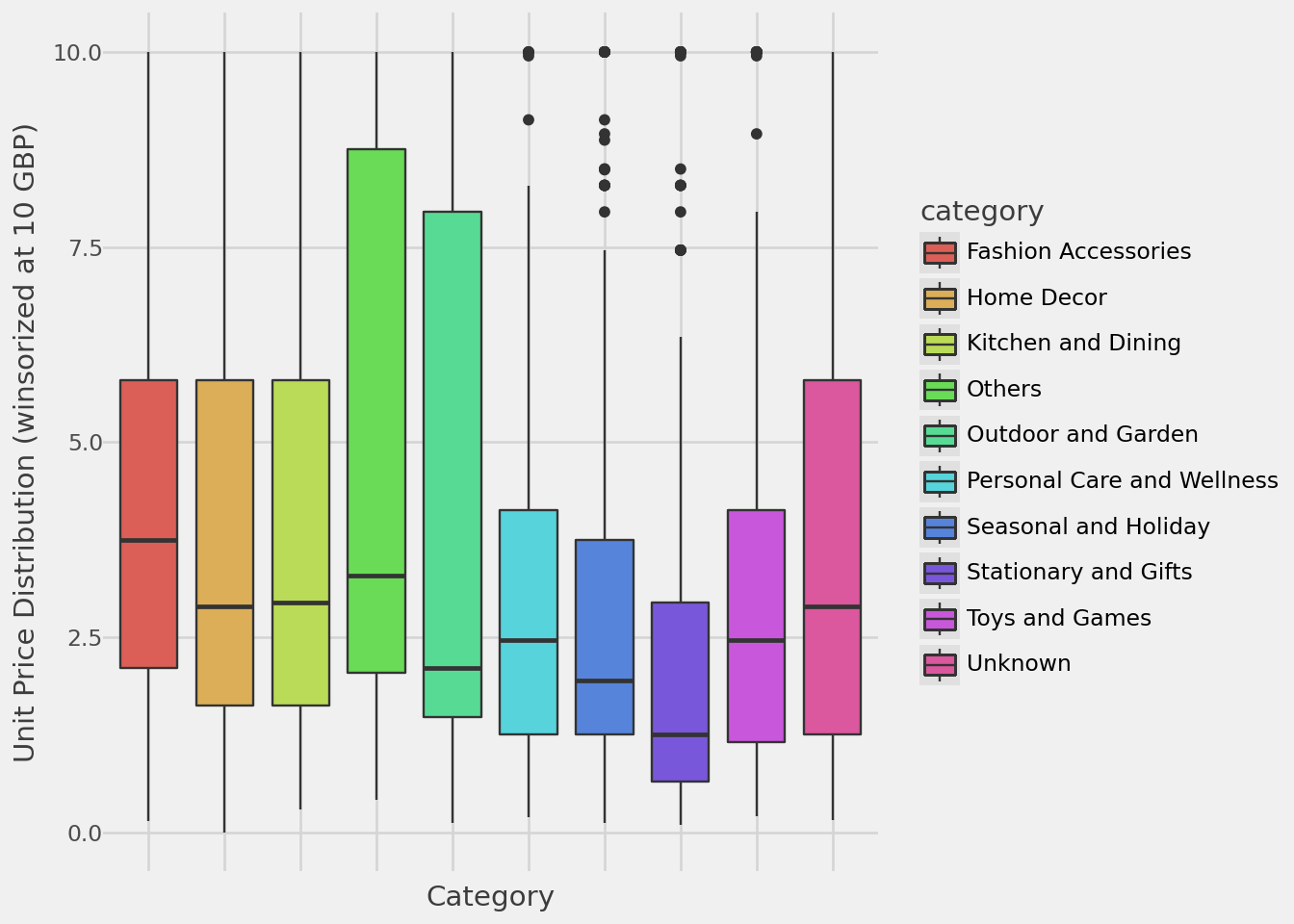
We can also look at price distribution by category. There are various flavors of putting histograms side-by-side namely box (showing median and interquantile ranges), violin (showing smoothed kernel density) and swarm (showing non-overlapping points) plots.
Code
d = df.groupby('StockCode')[['category','UnitPrice']].max().reset_index()d['UnitPrice_capped'] = d['UnitPrice'].map(lambda x: x if x<10else10)g = (ggplot(d, aes(x='category',y='UnitPrice_capped',fill='category'))+ geom_boxplot()+ xlab('Category') + ylab('Unit Price Distribution (winsorized at 10 GBP)') + theme_538() + theme(axis_text_x = element_blank()) )g
product price movement -> when to stock up
price sensitivity per product/category -> which ones we can afford to discount/raise price
basket size (units) over time -> can we consolidate?
Nurturing Our Customer Base
customer sales distribution -> who are the core customers